Credit Card Application Uplifts
Legacy American Express Credit Card Application Design
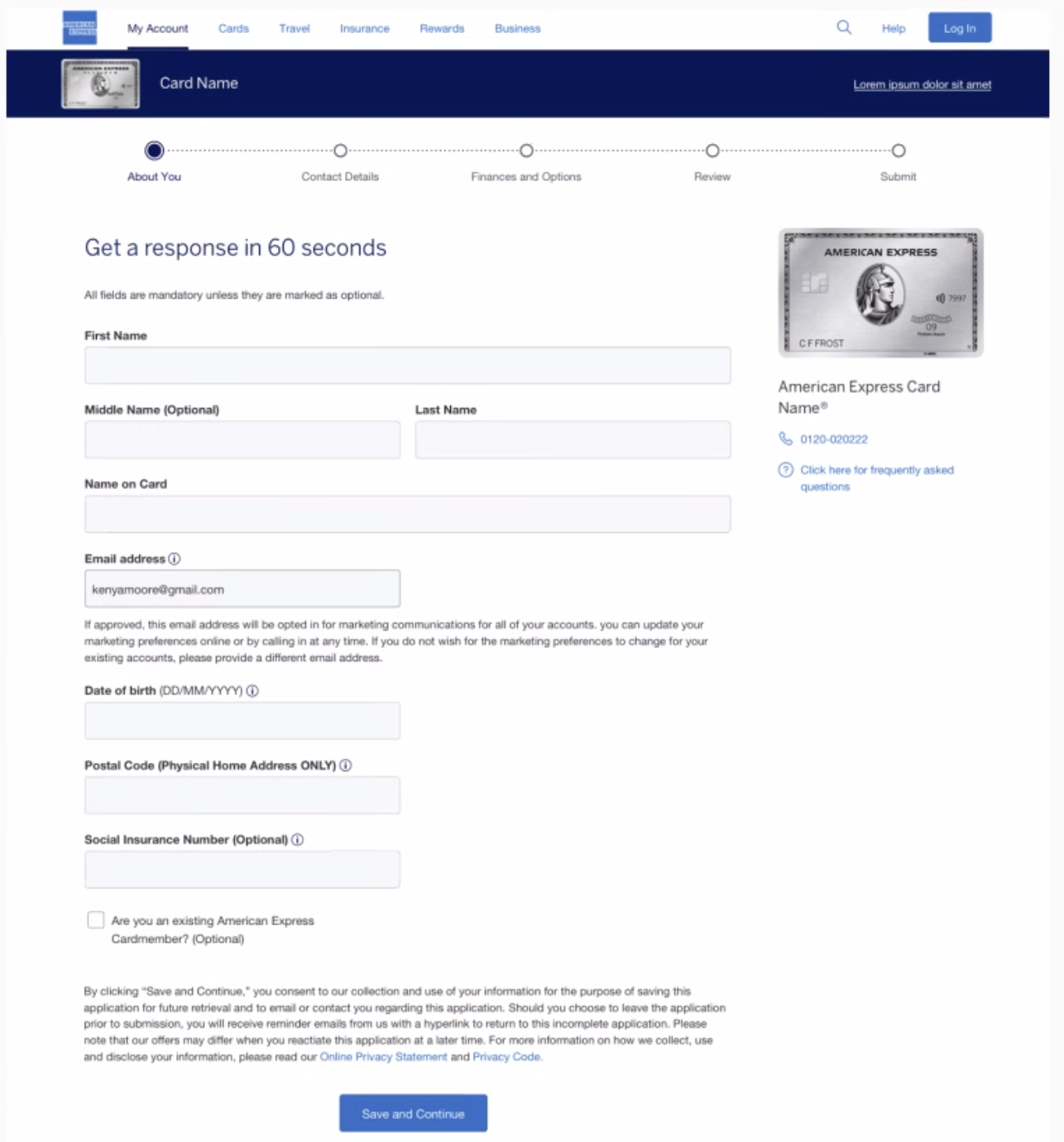
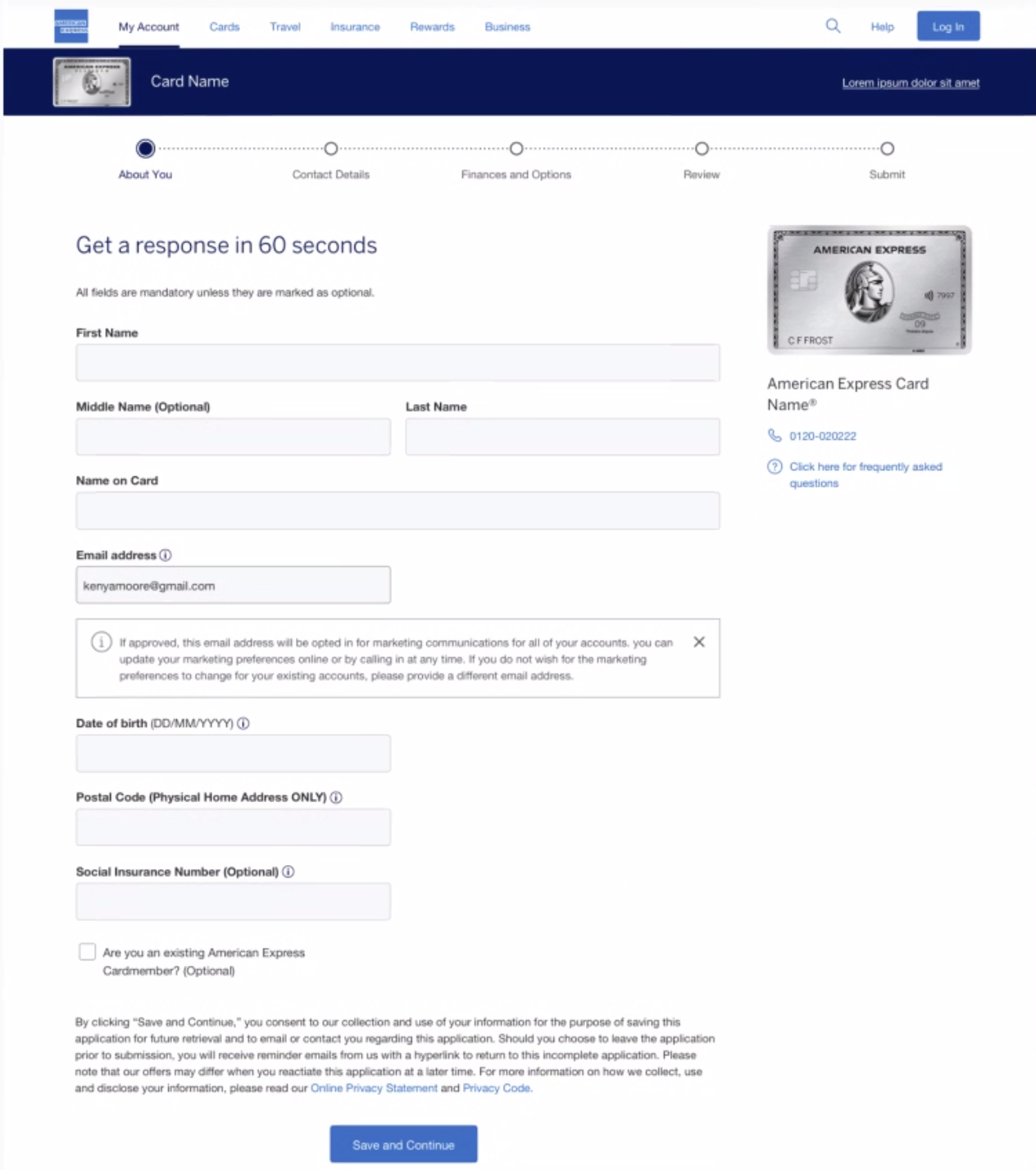
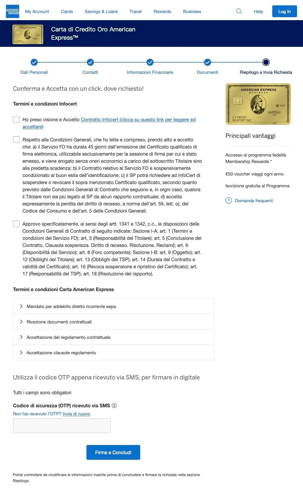
In my first year at American Express, I held the role of Lead Senior UX Designer for international e-apply. During this time, I elevated designs to align with American Express's revamped Design Language System, tailoring features to suit the distinct needs of each market. In some instances, I navigated the challenges of working in an entirely unfamiliar language, showcasing adaptability and a commitment to delivering exceptional design solutions.

France

Expected Annual Revenue Impact of $1.2 million and increase application submit rate from 17% to 25%
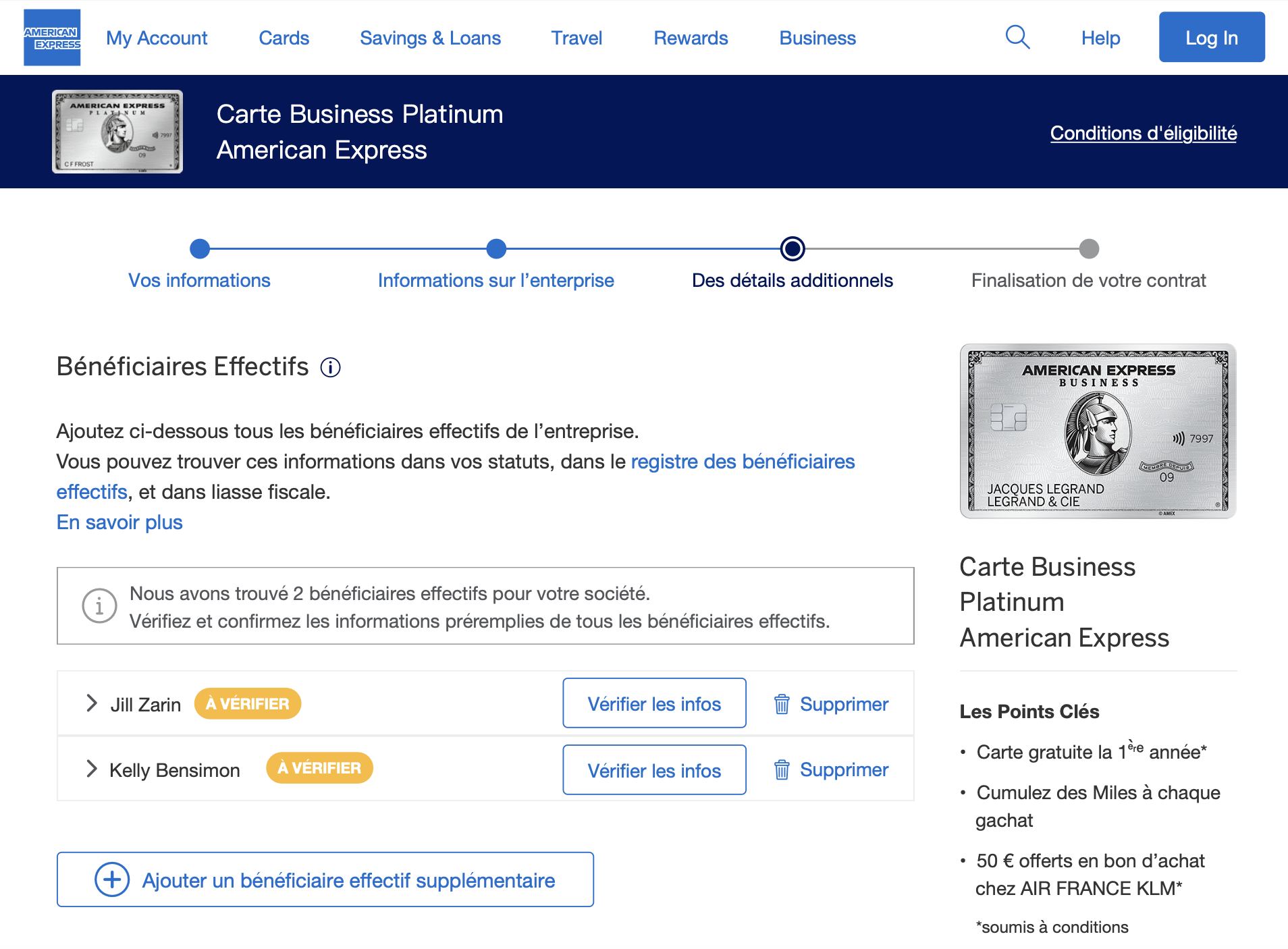
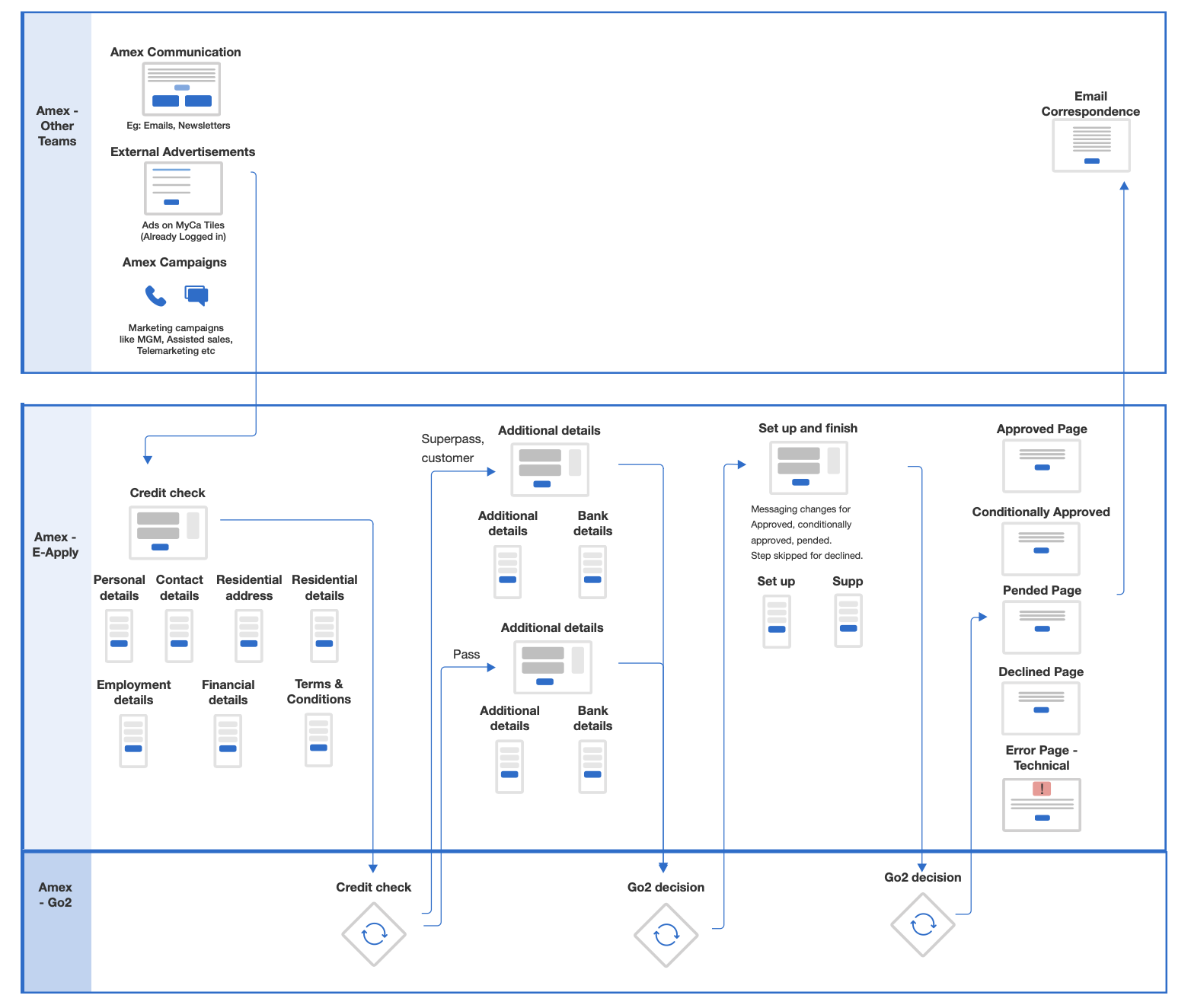
In tackling the unique challenges posed by the French market, characterized by the lowest completion rate and highest drop-off rate globally, our team spanning multiple time zones aimed to enhance user experience and boost application completion rates. Recognizing the strategic potential of a prefill feature, the team leveraged this solution by allowing users to input a unique business number, prefilling most of the application with publicly available data.
We started the process by exploring customer pain points through qualitative and quantitative feedback, collaborative sessions with the UX research team, unmoderated studies and iterative prototype evolution based on user interviews. The overarching goal was to use France’s prefill application as a proof of concept, laying the foundation for international rollouts.
As the lead designer, I spearheaded the integration of prefill into the application, addressing customer pain points through a comprehensive approach, working closely with UX researchers, UX content writers, the French market, project managers and engineers.
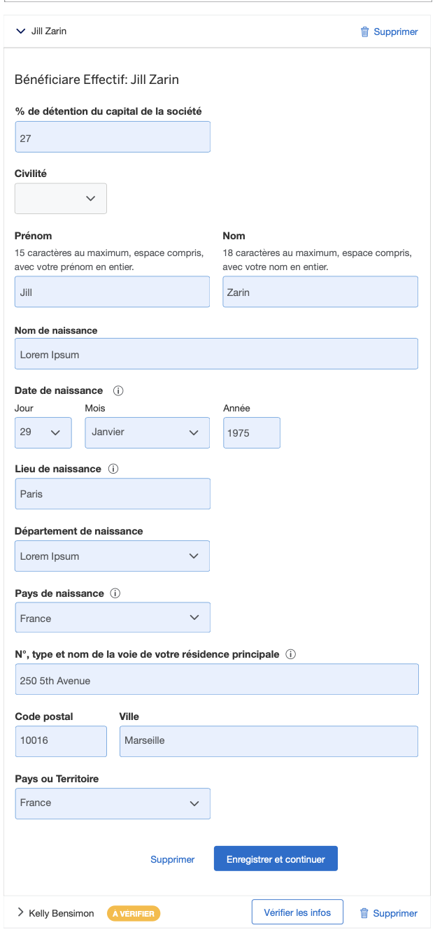
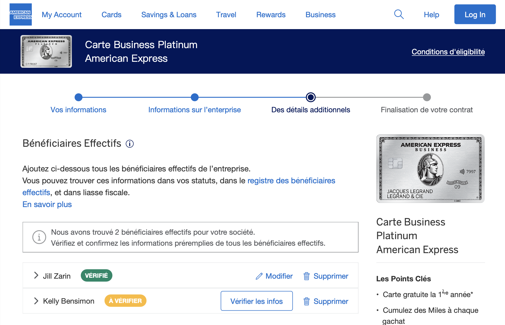
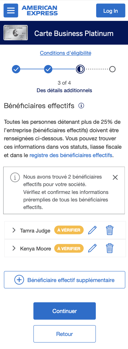
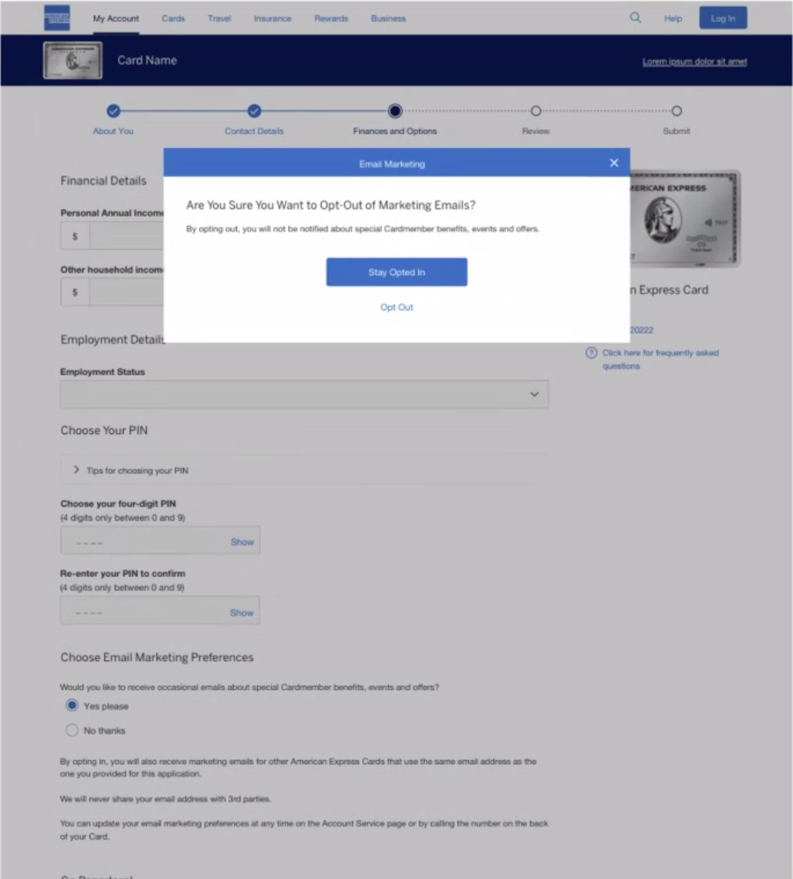
Feedback from unmoderated usability tests showed the team that the revamped application flow garnered mostly positive feedback. Participants engaged with the prefill feature, validating our approach to deliver a fast, simple, and clear user experience. However, a friction point emerged in the beneficial owner section on the final page of the application, prompting strategic changes to enhance user understanding and experience.


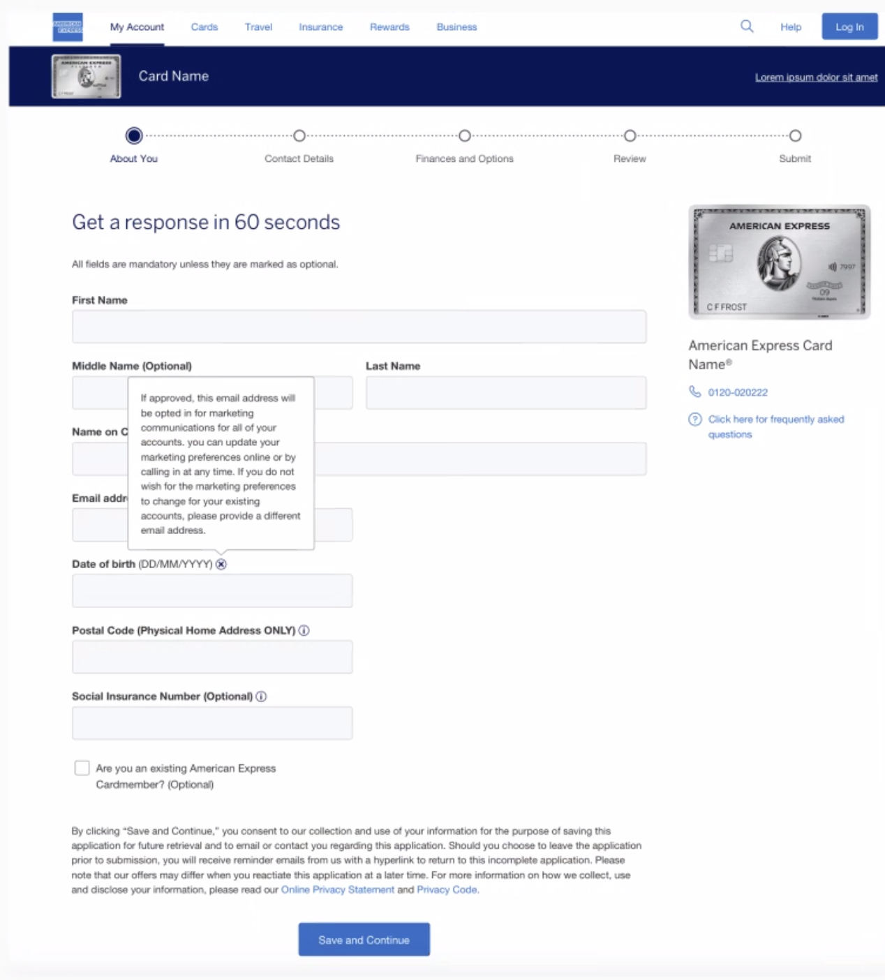
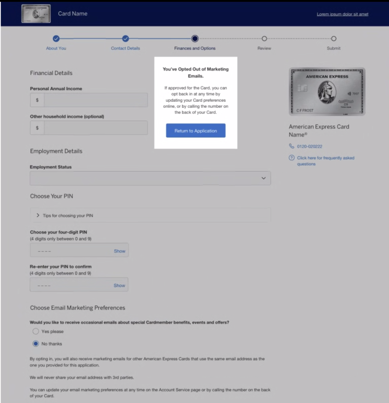
Working closely with UX content writers, we altered the copy at the very start of the application to strongly encourage applicants to use the prefill feature. Moving to the part of the application where participants struggled the most, leveraging research insights, I implemented design changes by adding an information box and a yellow alert badge that guides users to verify the prefilled information. Once the user verifies all beneficial owners, the badge turns green and a success message is displayed. The result of these design changes were a more straightforward and clear call to action, improving user understanding and experience, which was confirmed in an additional usability test.
Desktop


Mobile


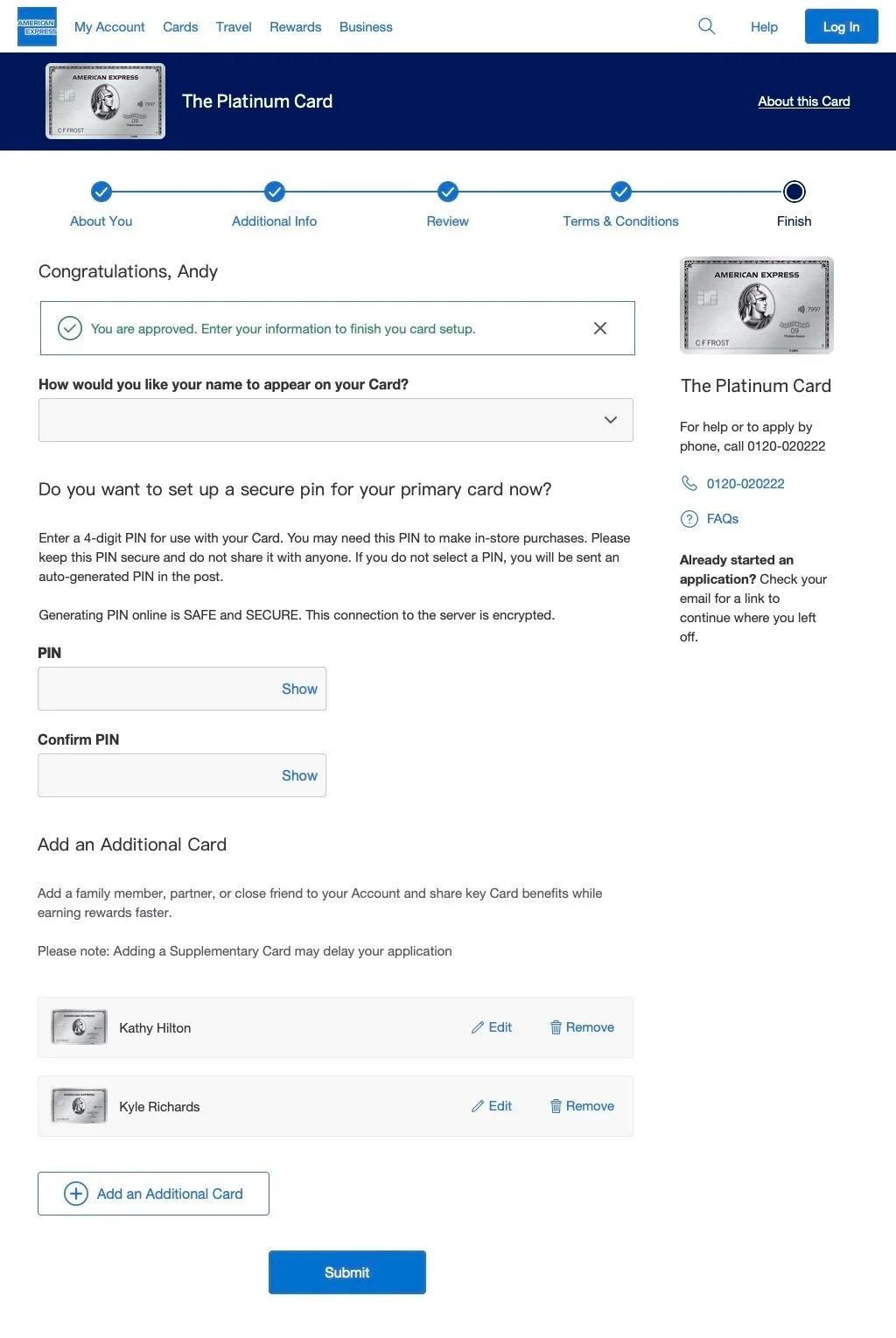
Upon finalizing the application design, I collaborated closely with developers, ensuring a seamless implementation. I also participated in the design QA to ensure the developed application aligned with the intended user experience.
The impact of the uplifted France credit card application was significant, with the application submit rate increasing from 17% to 25%, poised to elevate annual revenue by $1.2 million. Beyond metrics, our efforts for the French market laid the groundwork for prefill features across Amex applications, setting a design standard for best practices throughout international markets. This not only streamlined future design efforts but served as a testament to the cross-market


Australia

Reduce cancellations by 50%, resulting in 2.6K NAA; reduce time to onboard by 7 days, increasing billing as a result; projected $990 million in revenue over 5 years
Utilizing insights garnered from my design work on France’s credit card applications, I efficiently crafted an enhanced credit card application uplift for desktop and mobile platforms in Australia. While having the French small business pre-fill uplift designs already created, as a designer, I still had to ensure I was catering to the unique needs of the Australian market.
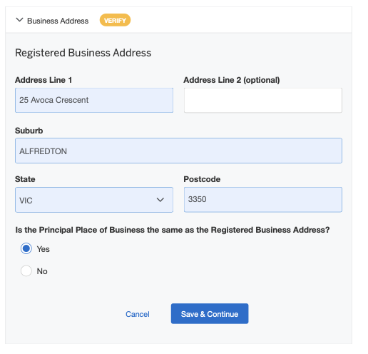
A significant challenge identified in Australia’s prefill was the accuracy of information, which was only 50%. Furthermore, users were not required to validate information before submitting their applications. To preemptively address potential discrepancies and enhance user efficiency, I collaborated with UX content on implementing strategic communication by incorporating informative text, guiding users to verify prefilled details in specific areas, including the business address and beneficial owner sections.
Following the methodology employed in France, the team ran an unmoderated user test. The primary objectives were to assess whether the design effectively prompted users to review and confirm specific prefilled information and to gauge user comprehension regarding the option to submit the application without reviewing prefilled details. The caveat here is that while users can submit an unverified application, American Express will contact the applicant in the future to verify the information. The insights derived from this study significantly contributed to our overarching strategic approach to prefill, encompassing user preferences, comprehension of identifying information and pinpointing potential field-level friction with users.
The business impact of these improvements was substantial. Cancellations were reduced by 50%, translating to 2.6K Net Annual Additions (NAA). Additionally, the onboarding time was reduced by 7 days, resulting in increased billing. These enhancements are projected to generate $990 million in revenue over the next 5 years.

Page 1
Page 2


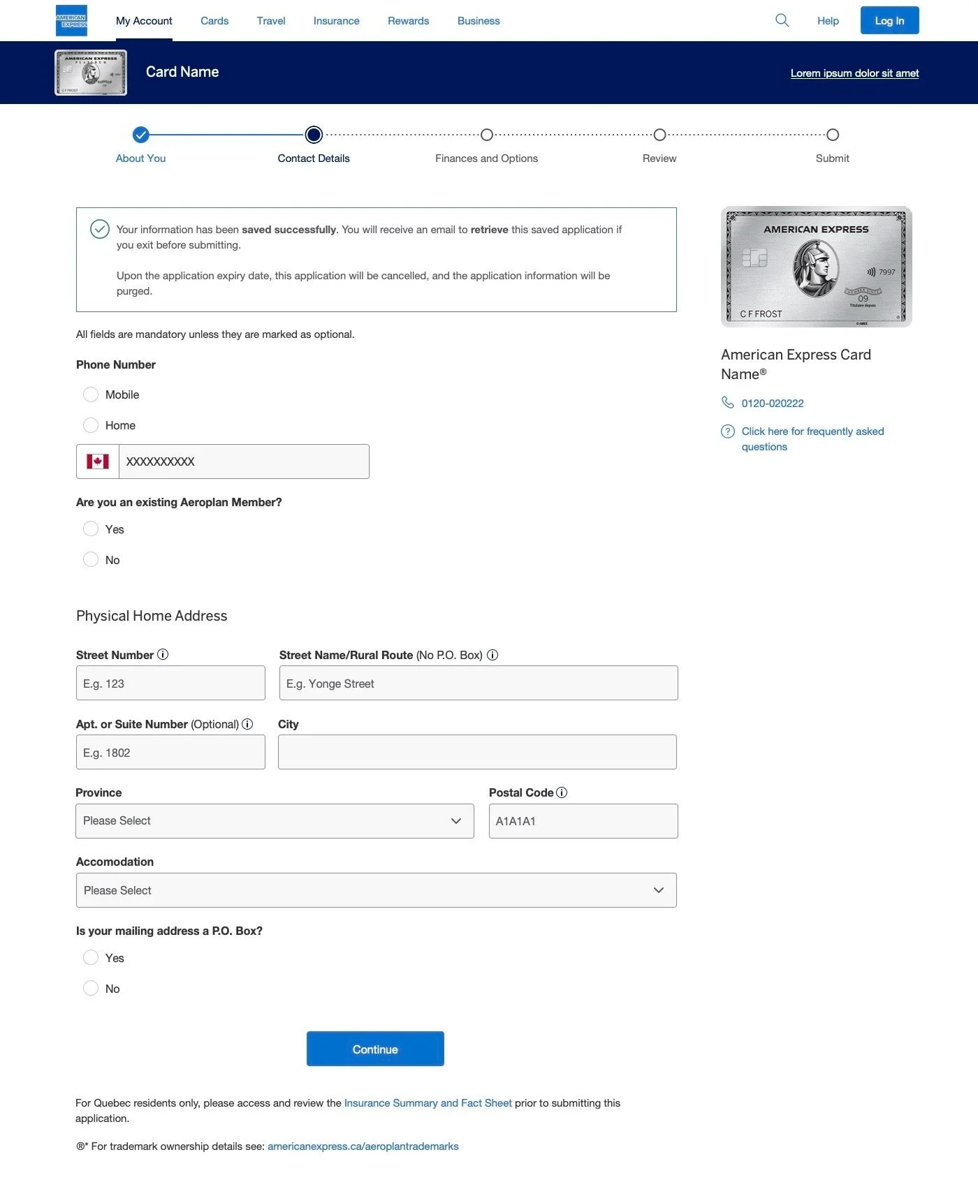
Canada

The Canada uplift consisted of consumer and small business applications. Among the international uplifts I designed at Amex, the Canadian project stood out for its simplicity, featuring minimal dynamic fields and no prefill requirements. This made it an opportune market for the integration of a new credit card application grid system.
My role was instrumental in introducing a new page-level grid that seamlessly adapts to various screen sizes. This innovative system allows components to effortlessly slot into the grid without ambiguity, offering a plug-and-play experience. By simplifying design work and reducing reliance on designers and developers, this approach allows our team to focus on strategic solutions and the development of new application features.


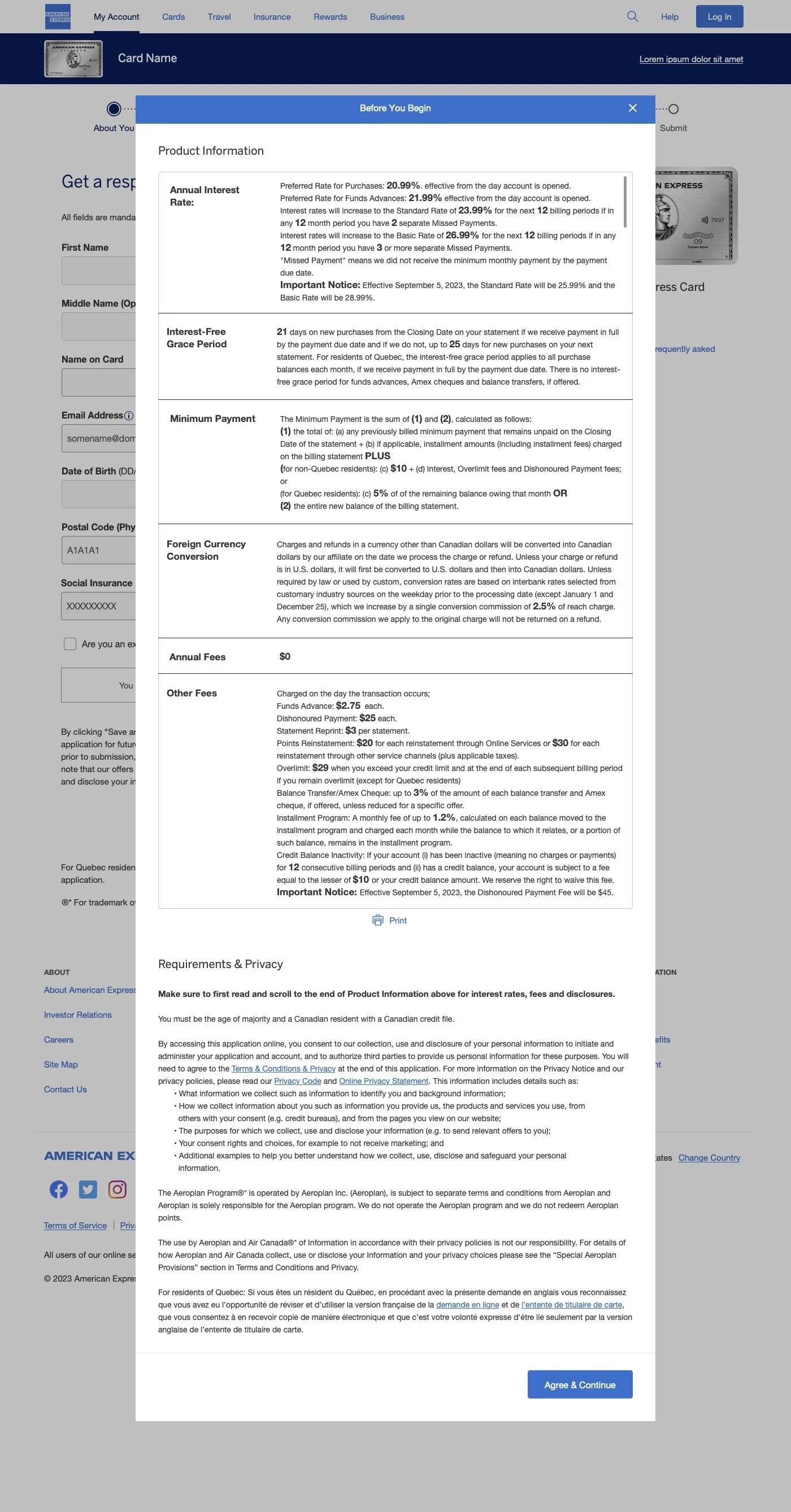
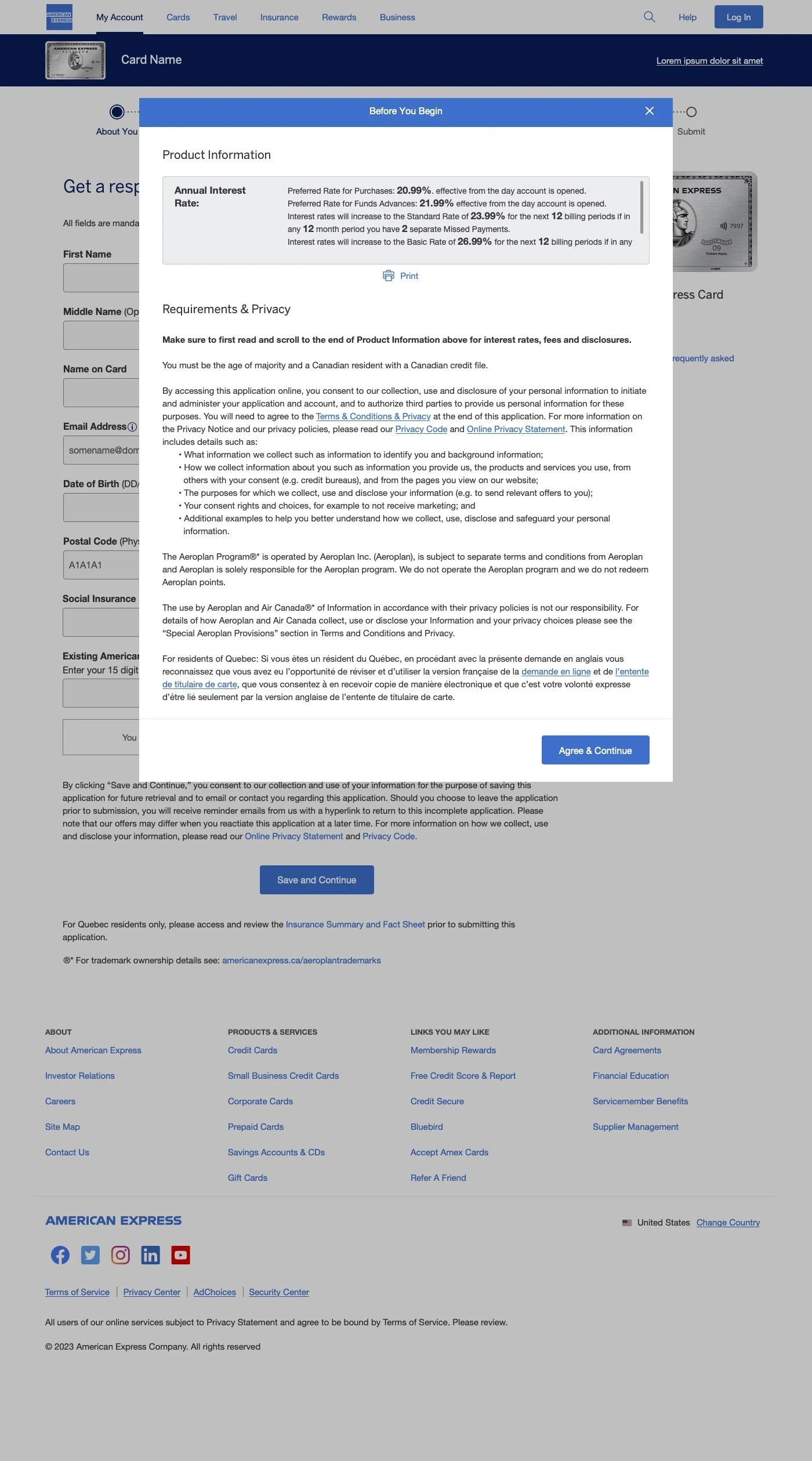
A noteworthy aspect of my contribution to the Canadian application was the design of the “Before You Begin” page. Unlike its counterparts in other international markets, Canada’s version incorporates lengthy terms and conditions, posing a potential deterrent to users. Recognizing this challenge, I collaborated with marketing, legal and compliance teams to come up with a solution to address these issues, noting that all of the terms and conditions had to be featured due to legal requirements. Through a series of iterations, experimenting with layout, page breaks and charts, we arrived at a version that breaks the terms and conditions down into smaller sections, alternating between gray and white backgrounds, mitigating information overload within a smaller, scrollable box.
Before You Begin - France Desktop & Mobile, UK Desktop & Mobile & Australia Desktop Respectively


Other desktop design presented

Desktop final in full
Desktop & mobile final - as it will appear for user

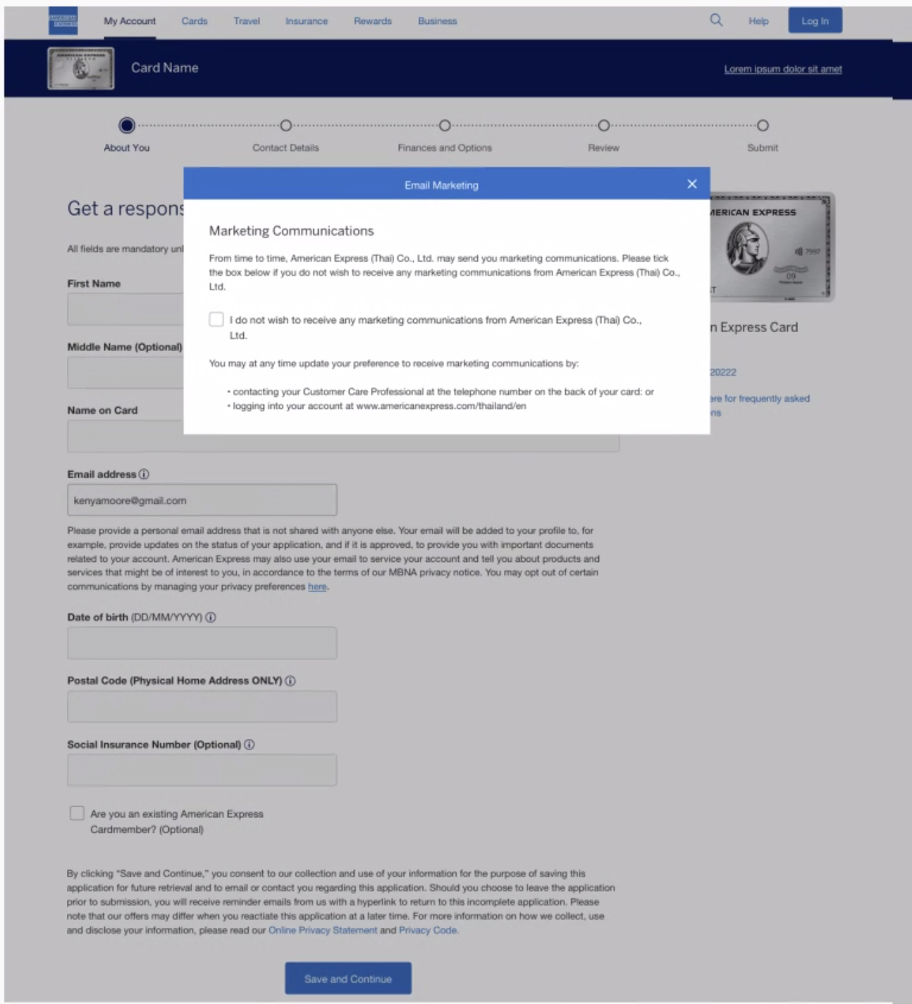
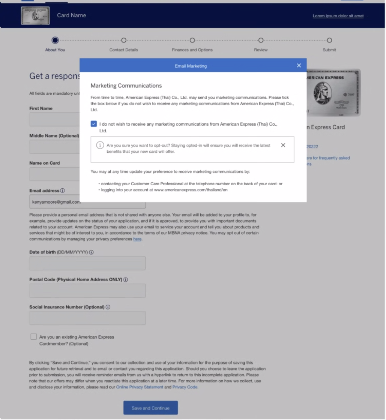
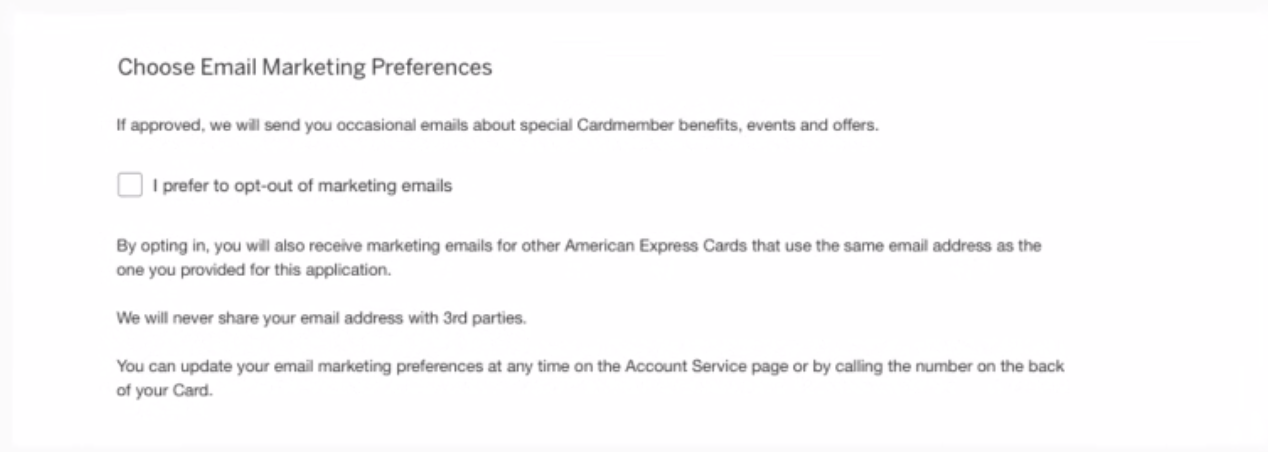
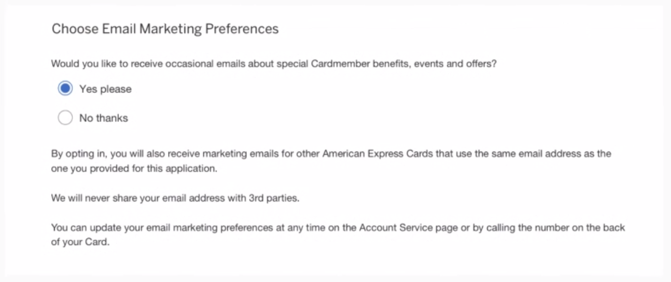
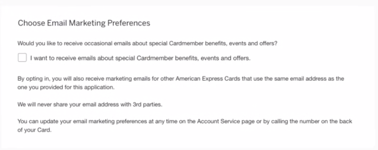
Addressing a unique Canadian legal requirement, the team needed to incorporate a marketing opt-out section into the application. Collaborating closely with UX researchers and content designers, I designed several options for an A/B test. Utilizing components from the American Express Design Language System, including tooltips, page-level notifications, dynamic text boxes and shadow boxes, I implemented designs on both the first page (associated with the email address field) and the third page (where the user indicates card and account preferences). The results of this study indicated a strong user preference for a separate marketing preferences section on the third page, alongside other account-related preferences like going paperless, adding a pin and requesting supplementary cards.
Iterations - Page 1


Iterations - Page 3


Final Marketing Opt-Out Design - 3rd page
These findings not only enhanced the Canada application but served as a valuable guide for future iterations of credit card applications where similar marketing preference sections may be required based on governmental laws and regulatory requirements. This approach is poised to save design and development time, setting a precedent for efficient and compliant solutions.
United Kingdom

Expected Increase of 4.88% of NAAR and an increase of over 23,000 NAA per year
I was the lead designer for the United Kingdom application uplift for small business credit cards and consumer credit cards for desktop and mobile. The United Kingdom applications marked the introduction of “Mobile Grouping,” an approach that involves breaking down the application into compact, logical and easily digestible sections, mitigating the need for endless scrolling on smaller screens. This tactic was rolled out to all other international markets.
The business impact projections indicate an expected increase of 4.88% in Net Annual Active Revenue (NAAR) and a rise of over 23,000 Net Annual Additions (NAA) per year. This strategic initiative not only enhances user experience but translates into tangible gains for the business, underscoring the success of our design enhancements in the UK application uplift.
User Flow

Desktop Design Flow


Mobile Design


Italy

Unlike my design involvement in other international markets, the Italian market presented a different scenario involving an external design firm to complete the uplift. Part of the Italian application integrated facial recognition software to prefill specific sections. As the lead designer for several e-apply international markets, I provided this agency with comprehensive documentation ensuring adherence to the American Express Design Language System across all facets, including components, hex values, tooltips and error messages. This commitment to precision and consistency allowed for the external design team to seamlessly create Italy’s application uplift, adhering to American Express brand guidelines.

Desktop Designs


Mobile Designs


