Commercial Badge Update
At Amex, badges are used strategically to incentivize users to apply for credit cards. As the lead commercial credit card shop designer, I collaborated with consumer credit card shop designers to establish a cohesive approach to badge usage across the credit card shop space.
With meticulous focus on alignment, I ensured uniformity in how badges and offer boxes are displayed for commercial and consumer audiences for all credit cards in Amex’s portfolio, from premium cards like the Platinum, to more basic cards like the Green. This alignment not only streamlines development processes but sets a precedent for consistent visual elements across American Express’s shop ecosystem, establishing a guide to how badges should be used.


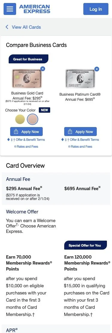
I designed an updated “View All Cards” page and compare page in desktop and mobile breakpoints. My contribution extended to redesigning the “View All Cards” and compare pages for desktop and mobile. Recognizing accessibility concerns, especially on mobile devices, I experimented with badge colors and placements, avoiding custom badges to minimize additional development efforts.
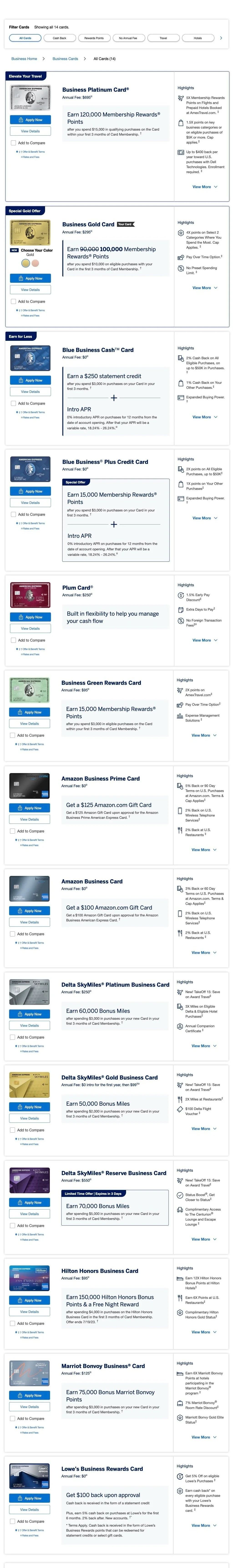


For product display pages, specifically for mobile, I experimented with different badge colors and locations because a dark blue badge on a dark background is an accessibility issue. As a team, we wanted to avoid custom badges, requiring additional development. For product display pages where users navigate to learn more information about a specific card, a strategic decision was made to utilize Business Platinum and Business Gold offer module layouts for cards with intro modules, facilitating a quicker development process.


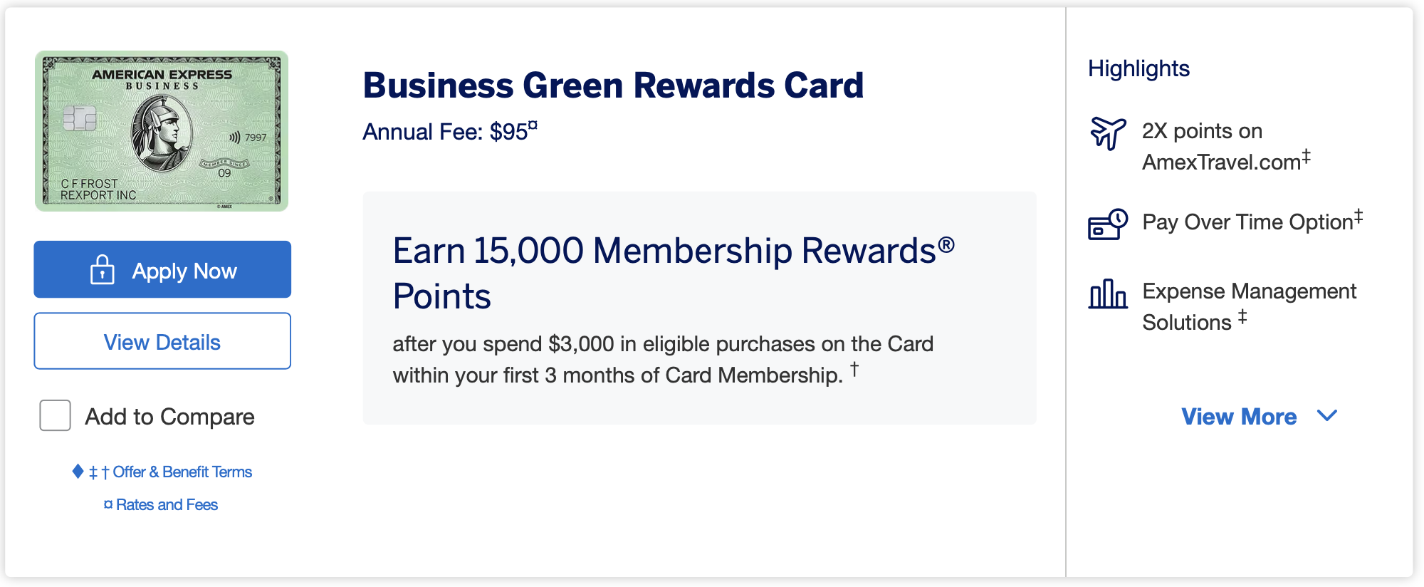
After deciding on badges as a team, I reworked product display page badges and offer boxes for Business Blue Cash and Business Green in desktop and mobile breakpoints.

Before Update


After Update


Specifically addressing challenges with cards featuring intro modules like Business Platinum and Business Gold, I undertook the task of ensuring accessibility on diverse background images while adhering to brand guidelines. This involved creative incorporation of gradients to integrate components without obstructing the subject’s face, regardless of screen size. The team collectively decided on a deep blue badge with a white border, ensuring visibility on darker backgrounds while minimizing the need for additional development. This holistic approach to design enhances user engagement and showcases a commitment to efficiency and accessibility across the credit card shop experience.

Before Update


After Update


